Making Chess for Pico-8 - #2: Juicyness
I'm Krystian. I make games and teach game design. I recently wrote a Chess Engine from scratch in Pico-8. In this series of posts I will walk you through the process and share with you some resources I relied on.
The Juice
The term "Juicyness" captured the imagination of the Indie Dev scene in the last decade. I heard it first introduced in the seminal "How to Prototype a Game in Under 7 Days" article by Kyle Gabler and the Experimental Gameplay crew. The term struck a chord and was eventually immortalized in two famous talks - one by Petri Purho and Martin Jonasson, the other by Jan Willem Nijman from Vlambeer.
There have been some attempts to widen the discourse by introducing terms like Game Feel. But somehow, Juicyness proved to be more catchy and pragmatic. I always say "Juicyness" is to "Game Feel" like "Usability" is to "User Experience". One is a more focused, pragmatic but also short-sighted special case of the other.
Applying Juicyness to an arcade game like Breakout seems straight-forward. But the challenge with Pico Checkmate was bringing Juicyness into the rather static genre of turn-based strategy.
Cursor
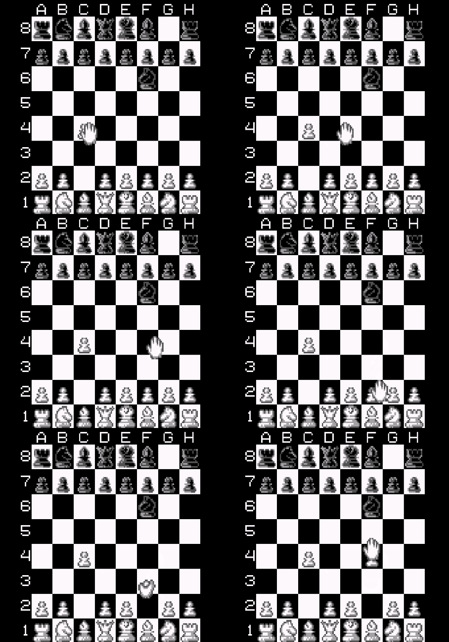
Since I was working with Pico-8, I could not rely on a mouse as input device. The pieces would need to be selected and moved with some kind of cursor. That cursor would be controlled by the d-pad and the two buttons of the Pico-8 system. In my research I was surprised in how other games dealt with that part of the UI. For example, Chessmaster used a hand cursor to grab and move the pieces. However, the player would move the hand cursor smoothly in an indiscrete fashion. To me, this had multiple, clear disadvantages. For one it wouldn't be always clear which piece the cursor was pointing at. The square selection process would be subject to all sorts of pitfalls like Fitt's Law. Also, it could take a long time to move a great distance. The player would need to keep pressing in a direction and wait for the cursor to cross the distance. Finally, it seemed like that amount of precision didn't really contribute to anything. It's not like I have a greater control over the game if I can decide where exactly I grab the pieces. They would snap to the squares anyway.
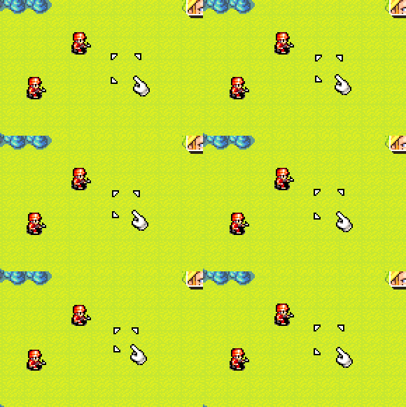
Advance Wars felt a lot better in this regard. The cursor would jump quickly between individual squares, allowing players to cross a great distance by simply tapping the d-pad multiple times. This would also allow players to play the game "by feel" - selecting squares precisely by counting off how many times they tapped a d-pad button. Something that surprised me in Advance Wars was how visually complex the cursor was. It consisted of a small white hand and some additional arrowheads in the corners. This was a lot more elaborate than I remembered.
For Pico Checkmate I wanted to have a similar feel to the Advance Wars cursor but a less technical, more inviting look. I experimented with various hand cursors. I was surprised how many pixels were necessary to convey a hand in satisfying detail. I eventually looked into other games that used similar cursors for reference and one that seemed to work very well was a cursor used in Mario Paint. I ended up using that cursor for the game.
One challenge for the UI for computer Chess programs is to indicate clearly which move the AI made. The AI can take a few second to "think" about their move. In that time, the user can easily lose focus and pay little attention to the screen. When the AI eventually decides which move to make, the user may completely miss any changes to the board state, especially if the board changes instantaneously. A typical solution is to highlight the piece that was moved last with a special color.
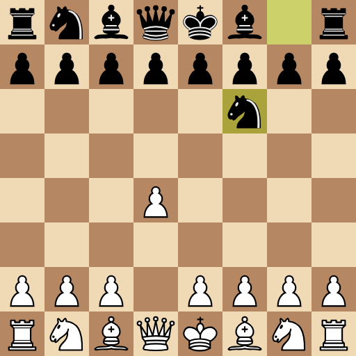
However, that solution is static and I wanted to try something more playful and dynamic. I went for a system where the AI would take control of the cursor on their turn. They would move the cursor to the piece it "wanted" to move and perform the move just as if a human player was operating the UI. The sound and animation are typically enough to grab the player's attention and to clearly communicate what is happening. Additionally, this turned out to have some hidden advantages. It takes some time to move the cursor to the desired piece. I decided to exploit this to mask some of the "thinking" the AI is doing. The AI will start moving the cursor while it's still calculating their move. Even before the calculations are done, the AI will already have a preliminary candidate for the possible best move. I let the AI move the cursor to that candidate. If the candidate turns out to be the best move, it will look as if the AI took less time to calculate the move than it actually did. If the AI abandons its first candidate for a better move, it will look as if the AI "changed its mind". It makes the AI look more human. On a more technical level, it also gives me some insights into the AIs "thought process".
Of course, this visualization is not without disadvantages. One issue that I was struggling with was to clearly communicate whose turn it is. In testing I found myself staring at the screen and not realizing that it was my turn to move. I thought about somehow changing the cursor to indicate if it's white's or black's turn. Color-swapping the entire cursor never worked well, however. The hand wouldn't read as hand anymore and would tend to blend with the pieces. It wasn't until late in the process when I figured I could just change the color of the "cuff" of the hand cursor. This looked acceptable but I was worried it was still too subtle. I eventually decided to simply spell it out in text on the top of the screen.

Piece Animation
It is much easier to make a Chess game with a static board. Whenever a piece move you just clear the screen and replace it with a rendering of the new board. Animating the moves can be a complicated process. In this case I decided it was absolutely necessary. Not only did it communicate the moves more clearly, it would also add to much needed physicality to the game. Chess isn't a game with a lot of action. So I wanted to take any opportunity to make things look dynamic and lively.
The amount of complexity it added was surprising. There are up to two pieces that need to be moved around for any given move. I ended up implementing a system that can move an arbitrary amount of pieces. This had the side-effect of being able to do a neat board setup animation.

All pieces can overlap each other so I had to find some solution to deal with z-ordering issues. Pieces that were "behind" other pieces needed to be rendered first. But the ordering would change while a piece moves. To save tokens I ended up brute-forcing the issue and just rendering all of the moving pieces last. This had the least potential to cause confusing artifacts without the need for a "real" z-order solution. I did add a small shadow on the ground to make players understand better where in space the pieces are supposed to be.
When implementing a complex system like this it may be tempting to make the pieces move slowly so players can appreciate all the effort you've put into the animation. In my various Motion Design projects I learned that is is a bad idea. Slow animations would make the game feel sluggish and unresponsive. Quick, sudden movements feel dynamic, draw more attention and leave the audience hungry for more. This is especially true when using animation curves. I made sure the pieces had a bit of easing at the beginning and at the end of their movement. Also, their moves would always describe an arc - as if somebody had picked up the piece and moved it above the other pieces before lowering it down on its destination square.
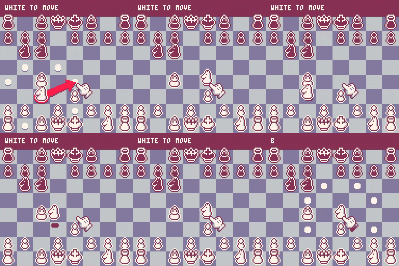
One lesson I learned from my old Flash times is how important a hover effect can be to make a UI feels responsive and playful. So quite early on I added a cute little hover effect when you move the cursor over a piece. I would move the piece by just 1 pixel upwards. It's a tiny detail but it add a lot of physicality to how the player interacts with the board. It's also a cheap effect in terms of programming effort that helped set the tone of the game early in the development process.
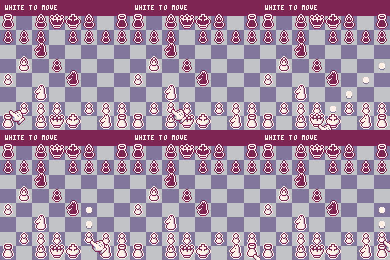
On a sidenote, this hover effect also made the piece animation feel more bouncy by accident. You might notice that in the animation above, the Knight bounces upon landing. This is is called an Overshoot and is generally good animation practice. However, in this case I haven't specifically programmed that in. It's just the piece doing the hover effect after it has been moved.
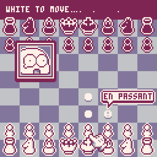
As I already mentioned, this was supposed to be a practice project for a bigger Chess-based game. In that bigger, future project I wanted to use non-conventional Chess pieces. So in Pico Checkmate, I already wanted to experiment with how to communicate to players the possible moves of a given piece. This also fit well to the overall idea if the game was targeted at less experienced players, who might need an occasional refresher on how the pieces move. My solution was to mark potential target squares by dots - similar to low Lichess is doing it. Pieces, that are being attacked are outlined in the special red color. I also wanted to expand this system by highlighting special moves like En Passant or Castling with a special symbol and a tooltip. I've managed to get the symbol in but ran out of space for the tooltip
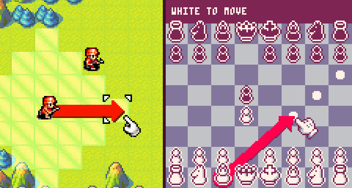
Advance Wars was a big inspiration for the look and feel of the game. One important feature was the implementation of the huge iconic red arrows so prominently featured in that game's UI. This turned out to be more complicated than expected and was one of the reasons why I lost track of the project at some point. As great as the function set of Pico-8 is, it's curiously missing any functionality to render polygons or even triangles. I've experimented with different approaches, some of them even tile-based. I always liked how the red arrows in Advance Wars would curve around corners. I initially wanted to implement this effect on the Knight's move. However, I soon realized I was spending an unreasonable amount of effort on this one UI detail. I finally swallowed my pride and decided to look up an off-the-shelf solution in the Lexalofle forums. I ended up up using this solution by scgrn to draw the arrows with polygons.
Indicators and Overlays
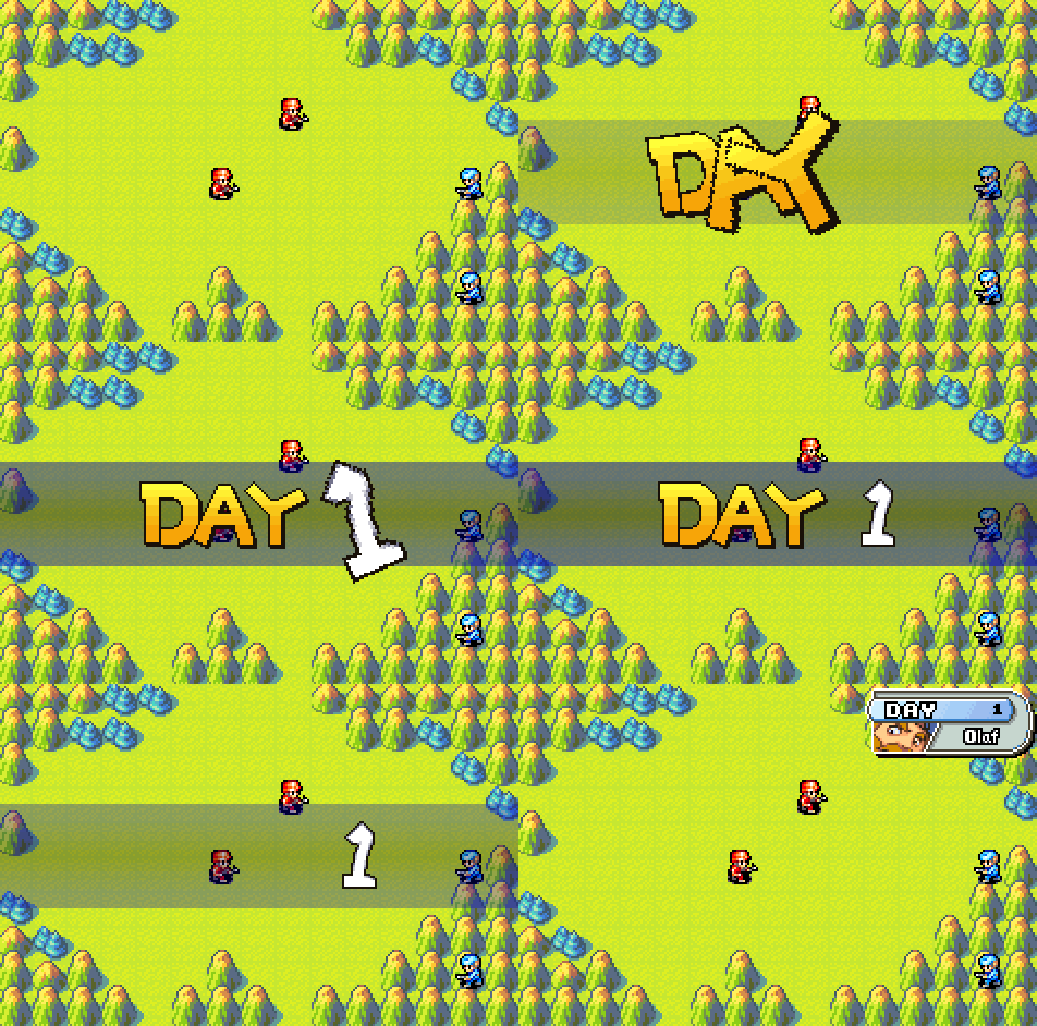
One appealing aspect of arcade-style games is how bombastic they seem to be in announcing otherwise mundane game events. In this type of aesthetic, even a game over can be a spectacular audio-visual experience. The unique approach of Advance Wars was bringing some of this aesthetic to the otherwise dry genre of turn-based strategy. Bold fonts would introduce events like a new turn beginning.
I wanted to bring some of that aesthetic over to Pico Checkmate as well. An obvious target would be Check and Checkmate. I wanted to make sure players know when they are in Check. I also wanted to visually reward players if they can pull off a Check. Checkmate, is obviously even more important as it means the end of the game.
Pico-8 doesn't have a way to render large fonts other than using sprites. I took the ever so popular Impact font, rasterized it to a 2-bit sprite and tweaked it manually to create templates for the words "Check", "Mate" and "Draw". The program then uses palette swapping and various outline and drop shadow functions to create the desired effect. I needed the multiple outlines to make sure the text would stand out against the already quite busy board. Like with the piece animation, I invested some extra effort into how the text moves across the screen - despite it being was very fast and short. For example, in a Checkmate you'll first see the word "Check" falling down from the top of the screen. A few frames later the word "Mate" moves in from the side and collides with "Check" to form "Checkmate". I added some screen-shake and a few all-white flash frames to emphasize the impact.
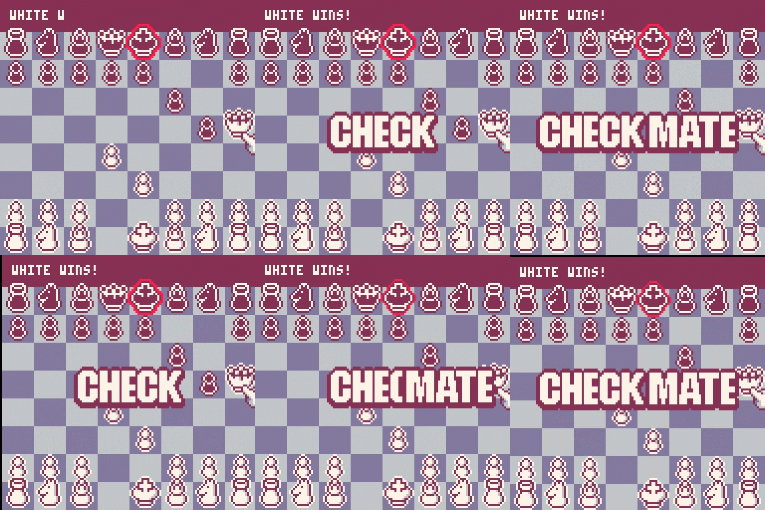
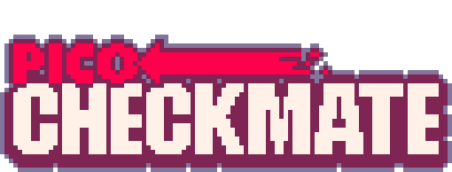
Conveniently I was able to re-use the very same sprites to form the logo of the game by simply calling it "Checkmate". I might have gone over-board in this specific instance. The outline-drawing functions for the text did eat into my token budget and I ended up having lots of free sprite space anyway. A wiser approach may have been to simply draw all off the outline effects by hand.
Chess doesn't need a lot of overlays, but there were are least 3 places where I absolutely had to show some kind of menu. One was a menu that would pop up when pawns were about to get promoted. Another would be some kind of in-game menu allowing players to concede the game or undo moves. Finally, I needed a start screen menu where players could pick which side they would play. All three menus needed to have outlines and drop-shadows similar to the ones used in the big "Checkmate" captions. I created multiple mock-ups in Photoshop to tweak this effect before implementing it. It was crucial for me to make sure any overlay will pop visually against a busy chess board.
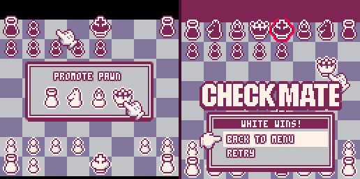
Sadly, all of these effects cost precious tokens. Pico-8 is a very restricted platforms that allows only a certain amount of code for a given program. The code is measured in a somewhat unintuitive unit called tokens. As mentioned before, certain effects ate severely into my token budget so by the time I was wrapping up I began looking for less extravagant solutions. One of the last effects I would implement was an activity indicator to show players when the AI is still "thinking". Depending on the settings, it could take the AI a good while to figure out their next move. I needed some kind of animation to show that the program has not crashed. I ended up animating the ellipses at the end of the status line "Black to Move...". I would make a new dot fly in every time the AI processed 2000 positions. This would introduce a slow, steady pace and provide some additional information on what the AI was doing.

Juice from a Stone
The term "Juicyness" can be a nebulous one and its meaning can be diluted to the point of becoming a vapid buzzword. By listing all of the above effects I wanted to show how a certain game feel is not something that is created by any given effect. Rather, it's an impression that emerges from encountering a myriad of little details orchestrated specifically with a certain result in mind. I also doubt that it is something that can be applied as an afterthought. Game feel needs to permeate and inform the entire game design process.
In the next installment I will go into the technical details of writing a Chess Engine. Until then, let's continue the discussion in the comments section.
Pico Checkmate
Simple, cute chess made in Pico-8!
More posts
- Making Chess in Pico-8 - #4: Chess Engine TuningAug 17, 2018
- Making Chess in Pico-8 - #3: Chess Engine BasicsAug 12, 2018
- Making Chess in Pico-8 - #1: DesignJul 27, 2018
- Version 6Jul 09, 2018
- Version 5Jul 05, 2018
- Version 4May 07, 2018
- Version 3May 02, 2018
Leave a comment
Log in with itch.io to leave a comment.