Pico Checkmate
Making Chess in Pico-8 - #1: Design
I'm Krystian. I make games and teach game design. I recently wrote a Chess Engine from scratch in Pico-8. In this series of posts I will walk you through the process and share with you some resources I relied on.
Design
In this article, I will walk you trough some of the Design decisions I made when working on Pico Checkmate. I do this for two reasons. For one, I hope to help other developers. This is not because I think my process is worthy of imitation. But I do believe that openness and transparency is something the Games Industry is still struggling with. As such we waste a lot of time repeating mistakes others already did in the past. The other reason I write this series is for myself. I believe that self-reflection is an important and often overlooked part of the Design process. But more on that later.
Planning
I made the original commit for Pico Checkmate in November 2016 (yikes!). Initially this was supposed to be a small prototype/learning project for a bigger Chess-related game. I realized I needed some experience with the foundations of a Chess Engine before committing to anything more ambitious. Making chess for Pico-8 seemed like the perfect bite-sized challenge. However, after a few initial productive days the project went dormant as I was distracted with ... other things. It wasn't until April 2018 when I finally committed to completing the project as part of the Chess Jam. By that point I had invested merely a week's worth of work into it. The final dev push took another two weeks and the project was submitted on time to the Chess Jam. So in all, the project took around 3 weeks to complete.
Design Goals
Before I began the project I was hoping to gain some insight how to structure a Chess Engine from already existing Pico-8 projects. However, a cursory glance at existing projects quickly revealed that most of them were what I would call "Virtual Chessboards". Which means they were 2-Player Hot-Seat type of Chess Programs. All of them would lack a Chess AI. They would keep track of only a subset of the Chess rules. Some of them wouldn't detect Check. Some of them would even allow unrestricted movement of pieces or wouldn't keep track of whose's turn it was.
It is not my intention to look down at those projects. Implementing the proper movement of all of the pieces is a respectable challenge by itself. A working chess AI is a daunting task by any means. However, I saw an opportunity to meaningfully contribute to the Pico-8 community while learning something in the process.
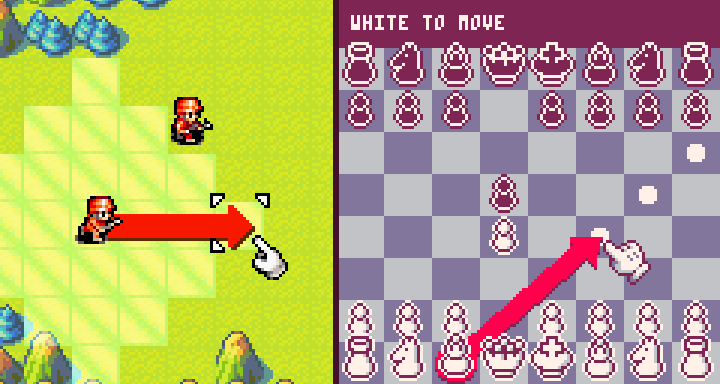
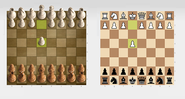
From the outset it was clear to me that my Chess Engine could never be competitive in any way. Pico-8 as a platform has severe limitations which would handicap it in an already highly competitive Chess AI scene. Plus, I'm not an experienced Chess Engine developer anyway. So I decided to aim for a pleasant and accessible Chess game - a cute, pixelart Chess experience for amateur Chess players like myself. The Advance Wars approach to Chess if you will. In fact, some of the visual details were lifted straight from Advance Wars, such as the bold, red arrows indicating the movement of units.
The Pieces
A big inspiration in terms of the visual design was Zach Gage's Really Bad Chess which also was targeted at a more casual audience. Something that always struck me about Really Bad Chess was the beautiful design of its pieces. The Chess positions are perfectly readable. Yet the pieces have an appealing, adorable look to them They feature tastefully exaggerated shapes and layered outlines of varying widths - a style reminiscent of vinyl stickers and comic book characters. I would later find out that they were taken from the highly underrated Tabac font designed for Chess puzzles in newspapers.

Of course, copying the Tabac chess pieces wasn't possible as they rely on high resolution vector art. Pico-8 has a resolution of 128x128 pixels. So my pieces could be only 16x16 pixels. On top of that, I had a rigid palette of 16 colors. Conveying the traditional Shapes of the Chess pieces within those restraints proved to be a formidable challenge. Sadly, I haven't saved my initial attempts. But my early designs turned out too noisy. It would be difficult to recognize the pieces. Also, when they were standing together, they would clump into a mush of pixels.
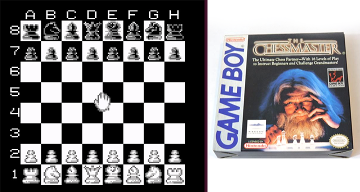
I was briefly researching how other Chess games solved this issue - especially those on the consoles. The Chessmaster series came to mind. However, this turned out to be a lot less pleasing than I remembered.
Eventually, I realized I have fallen into a common pitfall - I was trying to draw physical Chess pieces rather than the abstract Chess symbols used in Chess notation. Chess pieces work well in a physical space. On a screen however, it makes more sense to focus on a more abstract representation of the pieces - especially when working with pixel art. After all, no serious Chess player uses the 3D skin when playing on Lichess.
On the other hand, I wasn't necessarily making a game for serious Chess players. As I mentioned above, this was supposed to be a Chess game for casual Chess players - perhaps precisely the type that would pick a 3D skin on Lichess. As so often, there was a balance to strike here. Perhaps the two approaches weren't mutually exclusive. Readability was certainly a must. And for that it would pay off to look towards more abstract representations of Chess pieces. But also, I wanted to look for ways to introduce a playful, tangible physicality into the design as long as it didn't sabotage the readability.
Another important breakthrough happened when I chose to restrict my color palette even more. This is a technique a programmer friend of mine mentioned once. Since he focused on programming he felt he wasn't a good visual designer. He found he had troubles coming up with pleasing visual designs for the GUIs of his programs. So he often decided to severely limit the colors he would use, sometimes down to just black and white. His reasoning was that if his variables were restricted, there was less potential do make mistakes.
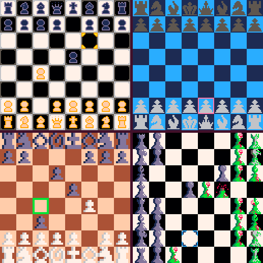
Initially I tried to use a lot of different colors of the Pico-8 palette so the pieces would pop against the board and the two sides would be clearly distinguishable. However, this lead to the aforementioned problem of the board being hard to parse due to excessive visual noise. Too many colors were screaming for attention. I think most of the previous Pico-8 Chess programs I mentioned above were struggling with the same issue. I was reminded of a similar problem described in one of the Tufte books when choosing colors for topographical maps. If everything is important, nothing is. When everything is loud, all you hear is noise. The solution was to "turn down the volume" of the image by restricting the colors to an even narrower color palette. I looked for other examples of Pico-8 games using only a subset of the available colors and found this beautiful mock-up by @castpixel:
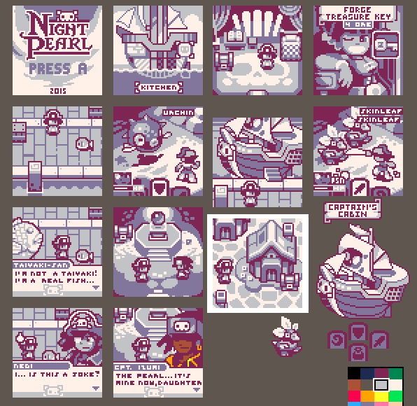
This is when the design fell into place. The restricted color palette added much needed harmony to the overall look of the game. Contrast between the individual elements was toned down. Over the course of the development I allowed myself to add one fifth color. I realized there would be situations where I would absolutely need to highlight certain elements. I wanted to highlight pieces that are being attacked. I also wanted to add the Advance Wars-style movements arrows. So quite naturally, the 5th color would be the iconic Pico-8 red. However, I vowed to use it only in exceptional cases.

Of course, with that few colors there was an added danger of elements blending into each other. So the visual design of the pieces needed to feature multiple layers of contrasting outlines - a style I was already aiming to mimic from Really Bad Chess anyway.
With a more restricted color palette and a focus on a symbolic representation I finally arrived at the my visual design for the pieces:
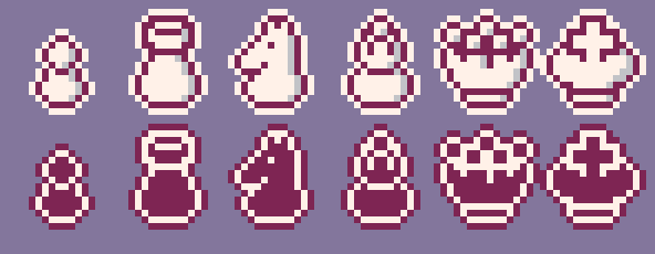
I thought this would be just a first design and that I would later iterate on it. However, in spite of the many issues I had with it, I found it hard to come up significantly better designs. Here some notes on the individual pieces:
- King - I don't like the lack of shading on the cross. It seems flat. It seems like It breaks the sense of perspective. However, adding shading makes the cross no longer read as a cross.
- Queen - This is the piece I am least satisfied with. It looks quite busy. The 5 spikes look crooked. That's because the width of the sprite is divisible by 2 so you can't draw a neat center line. I arrived at 5 spikes because 4 spikes didn't read like the Queen's crown and 6 was even more busy than this. I decided the busy look was acceptable considering there is only one Queen for each side.
- Bishop - A huge challenge here was making it read clearly as a bishop rather than the pawn. Chess symbols tend to use a cross on the bishop's "hat". The physical Chess pieces have a slit. I would have preferred the cross but it didn't read at that resolution - not without making the bishop's hat gigantic and competing with the King. So I went with the slit of the physical Chess piece. I tried different orientations and even though this one isn't the most intuitive one, it worked best in comparison. It's a bit noisy still but I think the overall silhouette of the piece wins over the messy details.
- Knight - The horse is fairly cute although it is a little ambiguous. It could be a dog or some other animal. I wish I had found a way to make it more horse-like. I tried a more pronounced mane but that didn't read well. Something that still bugs me is that the base doesn't transition well into the neck of the horse. The physicality and perspective of that transition is ambiguous. Adding more cues tended to detract from the symbolic look of the piece, however.
- Rook - A fairly successful piece. The only concession was not adding any crenelations (the vertical "teeth") to the top of the tower. They are fairly important in making the piece read as a medieval tower. However, they would add a lot of noise to the sprite - similarly how the spikes add noise to the sprite of the Queen. In the end, I chose to favor simplicity and hoped the silhouette would do most of the work.
- Pawn - I re-made that piece multiple times. The initial design was bigger. However, after I made the other pieces, I realized I had to scale the pawn down so it would contrast against the other pieces. This is the most common piece so it was important for it to be clean and noise-free.
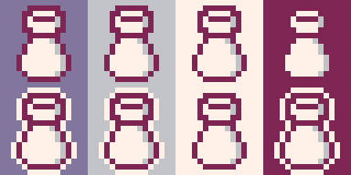
One last thing to note is that the white pieces have a line of grey shading while the black pieces don't have any shading. I initially had shading on the black pieces but it added a lot of noise to the overall picture. I decided to remove it to improve readability. This seems to be common in other graphical representations of Chess pieces - black pieces aren't just white pieces with inverted colors.
The Board
With the pieces finished I could think about the screen layout. Even though the sprites are 16x16 pixels, I decided to make the individual squares 16x14 pixels. This had two positive effects. For one, the pieces would overlap slightly, adding to a sense of perspective and physicality. But also, this choice would provide me with a stripe of additional 16 pixels of above or below the board to display additional GUI elements. I picked a square height of 14 pixels because 15 didn't result in any significant overlap. And anything less than 14 would make the board look uncomfortably squished.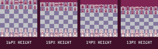
However, that choice also came back to haunt me. Remember when I talked about how I wanted to have Advance Wars-style arrows to indicate the movement of the pieces? It turns out that when the squares are no longer perfectly square, the diagonal lines between the squares no longer align neatly along the pixel grid - resulting in uneven jagged edges.

The Treachery of Design
Design can be a treacherous discipline because it can be hard to recognize when you're making mistakes. Conversely, good Design is invisible and well designed products seem straight-forward and obvious. This is different from many other skills. If you can't draw, you will see it in your drawings. If you can't program, you will undoubtedly realize yourself that you just don't know how to make the computer do what you want to do. But when it comes to Design, mistakes and shortcomings aren't obvious. This is often because the actual Design decisions aren't even recognized as decisions. Rookie game developers just go by their guts without realizing they are implicitly making important choices with far-reaching consequences. So to me, teaching Game Design often means simply making students become aware of the decisions they make. Once they are aware, they can start making informed decisions to steer the process in a desired direction. But this kind of awareness is not just something for becoming designers. In fact, I believe every designer should include self-reflection in their practice as a way to hone their craft.
So in the next installment of this article series I will discuss the different techniques I used to make Pico Checkmate feel more "juicy". Until then, let's continue the discussion in the comments section.
Comments
Log in with itch.io to leave a comment.
Great read! I really enjoyed hearing about your trials of coming up with a visually pleasing, satisfying chess game.
I definitely can relate with my own projects steering in several directions as I prototype and scope the project out. In the end I always tend to have something completely different than my initial idea :p
Thanks for the write-up. Really interesting to hear about the graphical evolution. The popping graphics are really striking in this game, and they look so perfect, natural and obvious to me, so it's cool to hear how much thought and how many iterations went into them.
Your point about not recognizing design decisions and that coming back to bite you certainly hits home, lol.